Every furniture painter who wants a quality finish on their pieces will have a similar method of refinishing...clean, sand, clean, prime, paint, wax/finishing coat. Well that’s my method anyway and there will be some who leave out a step or add a step. As I said in my previous post “prep is everything” and I believe if you want a lasting finish it’s a vital step not to be missed out.
This post also addresses the comments that furniture refinishers sometimes get from people, such as “anyone can slap a coat of paint on” or “ why is it so expensive? It only takes a couple of hours to paint a chest of drawers”, etc, etc. Sometimes they just don’t realise how many steps are involved in refinishing an old, scratched, chipped piece of furniture.
The example below shows MY method...it may not be yours! I should say that not every piece requires the same prep and some require repairs to drawers, chipped veneer, wonky legs, etc. Some pieces may just be prepped then given a basic paint job in a single colour. Others might be painted with blending effects, decoupaged, stencilled, gold leafed or other more intricate finishes.
So, here we go.... get your cuppa and biscuits out as this is going to be a long post!
This tallboy was in a bit of a sorry state when I purchased it - it was crying out for a makeover!

The first thing I do on any refinish is to take off the old hardware. As you can see, two drawer handles were missing, so the whole set had to be replaced. I always keep the original hardware, as it can be re-used on another piece. Removing the hardware is essential for the sanding stage anyway and I always like to give them a good clean (while still retaining their patina).
Next step is to give the whole a good clean...I used a damp cloth to remove any dust and fluff on the inside while the outside got a thorough cleaning with sugar soap, then rinsed with lukewarm water and allowed to dry completely. If you haven’t heard of sugar soap just ask your dad what he used to clean a wall before hanging wallpaper! It removes dirt, oil, grimy build up and even some nicotine stains. I believe that while sugar soap is widely used in the UK and Australia it’s not so well known the the US, the nearest equivalent being TSP.
Once dry, and before sanding, I filled in any deep dents and scratches or small areas of missing veneer with a paintable wood filler. Once that was dry I sanded the whole piece with an orbital sander (I also use a mouse sander on smaller or more detailed pieces). I started with 80 grit sandpaper to remove most of the old varnish/paint, then went over it with 120 grit to give a nice smooth finish. It’s important that you don’t over sand as a lot of furniture veneer is quite thin!

Sanding can be quite a laborious task - not my favourite part of the process by any means, but as I’ve said previously your finish will only be as good as your prep. I know a lot of chalk paint manufacturers tell you that no prep is required but in my experience no prep equals an uneven finish that just won’t last without chipping.
After sanding I go over the whole piece with a damp cloth to get rid of the dust. It’s important to have as clean a surface as possible to get good results when you start painting.

Next step was priming. On this tallboy I was expecting some bleed through, so I knew it had to be well primed before painting. Bleed through is a staining that will show through your paint and is caused by a variety of reasons, such as natural resins in the wood “bleeding” into the paint (a good example of this is knots in pine). Sometimes bleed through is caused by the piece not being allowed to dry properly before applying your paint. Mahogany and cherry will usually bleed quite badly and can cause a discolouration and staining to your paint, so they need to be primed, preferably with a shellac based primer. In the case of this tallboy I was able to use my “go to” product - Frenchic Finishing Coat. I used two coats, allowing it to dry for an hour between coats. Prep finished!
My colour choice for this piece was a pale duck egg blue chalk paint. I painted one coat then went over it lightly with a high grit sandpaper just to smooth out any little uneven areas. I wanted to do something to liven up the drawer fronts, as the whole piece was quite plain. I decided that a raised stencil would give it some dimension and some personality. As a papercrafter I use several die cutting machines and I knew my Brother Scan n Cut would be perfect for cutting a stencil in Mylar, so out came the machine and after changing some of the settings and creating a design I had a homemade stencil all ready to use!

I could have used the stencil in the regular way, by stencilling on top of my final coat of paint in a contrasting colour, but I wanted it to look like it was part of the original piece so I used some modelling paste after the first coat of paint. It takes a while to dry completely, so I left it overnight before adding a second coat of paint.
I love the way the stencilled area looks. It’s quite subtle, once painted, but very effective. This photo shows the stencilled area before paint was applied.
Of course, you could use a coloured modelling paste and simply do your raised stencil after your final coat of paint if you wanted to.

You can see in this photo how the stencilled area now “blends in” after two coats of paint and it looks like it was always there! I didn’t want to leave it like that on this occasion - I just knew I wanted gold highlights on this piece and the stencil was just calling out to me!
Before adding the gold I used a fine grit sanding block very lightly over the whole piece to smooth out any tiny bumps. I like to run my hand over the whole surface so I can feel for any imperfections as they’re not always noticeable at a glance. I then wiped off any dust created by the sanding and applied some dark wax to the edges of the drawers and the body as well as to the stencilled area. I use dark wax on almost every piece I paint as I really love the aged effect it gives.

White wax is another favourite of mine as it can give a whitewashed look and can add a nice effect when added to a pale coloured piece.
Now the tallboy was ready to be glammed up! I decided to use my Shiva oil paint stick in Antique Gold - I didn’t want as bright a gold as using gold leaf would have given me. Also, I find gold leaf really messy to work with, especially in larger areas.
I use gloves when applying the oil paint stick as I like to blend it in with my fingertip and it can be a little difficult to wash off.

You just use these sticks like a crayon and then blend over the area you want to cover. The different colours can be blended together to get gorgeous effects. I have the set of 12 iridescent colours and have used a combination of colours on several pieces of furniture to great effect. Because the sticks are made of oil paint they do have a longer drying time...up to 48 hours if applied thickly. Once cured it’s there forever! In this case, because I’d applied a very thin layer to the stencils and the drawer edges, I left the paint to cure for about 24 hours before testing it with my fingertip.
All that remained to be done to finish this makeover was to apply two coats of clear wax and add some new hardware. I allowed the first coat of wax to dry for an hour then buffed it lightly before adding the second coat.
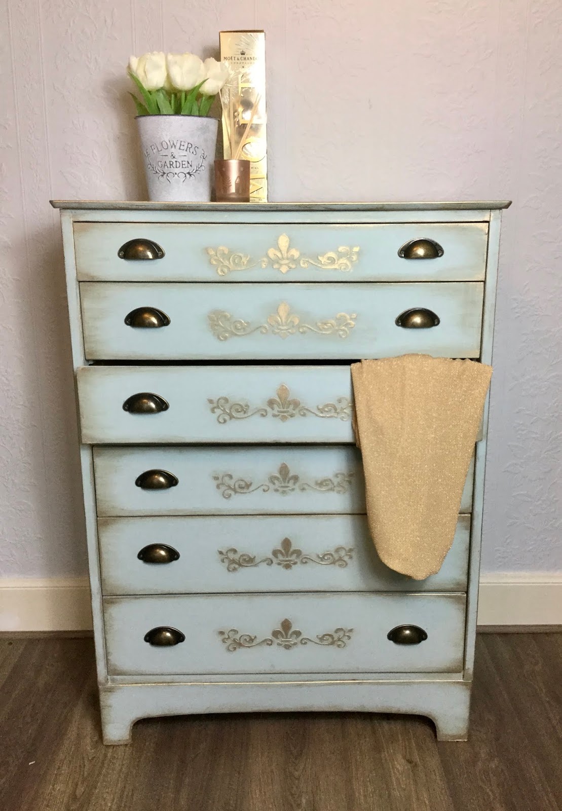
I chose antique gold/bronze cup handles which I thought looked smart on the drawers and wouldn’t contrast too much with the gold stencilling.

And there you have it...one tallboy chest of drawers has been given a new lease of life and will last for many more years!
Thanks for stopping by and please feel free to leave your comments below this post. If you have any questions you can use the contact form in the sidebar. I would also appreciate it if you would subscribe to the blog to receive notifications of future posts via email.
Sooze x